Lines are one of the most basic elements of art and can be found in nearly every piece of art that has ever been created. They can be thick or thin, smooth or jagged, straight or curved, and can be used to create a variety of effects in a painting. Understanding how to use lines effectively is an essential skill for artists.
 “Elements of Art” is a term that describes the building blocks of art itself. The way these elements are used are called the “principals of design.” There are approximately 7-10 terms in each category, although no one can really agree on the exact ones. (A side effect of there being no art police.)
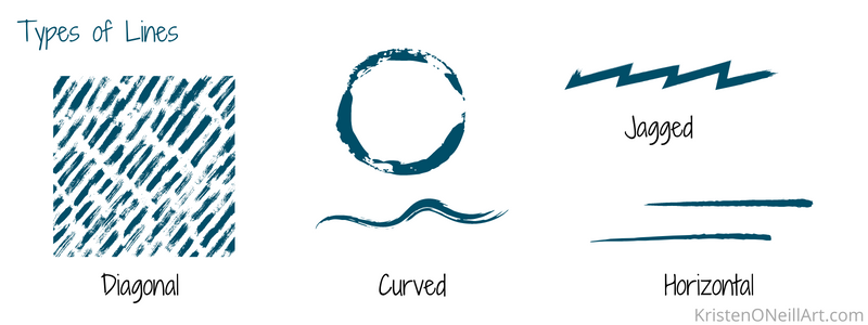
Lines can be used to create a sense of movement, direction, and depth in a painting. For example,
- a series of diagonal lines can convey a sense of energy,
- a series of horizontal lines can convey a sense of stability or calm,
- curved lines (“curvilinear”) can be used to create a sense of grace and fluidity,
- jagged lines can create a sense of tension and drama.
Lines can also be used to create contrast and interest in a painting. For example, a painting with a predominantly soft, curved line can be made more interesting by the addition of a few sharp, angular lines. Similarly, a painting with predominantly dark lines can be made more dramatic by the addition of a few light, airy lines. Notice how contrast and interest are created by opposites. We love a bit of variation, but not to the point of chaos.

©Kristen O’Neill, Green Moss Comes to the Protected Forest. In this painting, I was attracted to recreate the dynamic lines of the scene of the wildfire. Tall straight dark lines contrasting the light, diagonal lines.
When working with lines, it’s important to consider the overall composition of the painting. How you use lines can greatly affect the balance, harmony, and unity of a piece of art. For example, if a painting has predominantly horizontal lines, the addition of a few strong diagonal lines can create a sense of tension and instability, making the painting more dynamic and interesting (aka, not boring!).
Edges, where two areas of the painting meet, are another type of line to consider. John Singer Sargent was a master at creating hard and soft edges in his paintings. Looking at the painting above,
A – The edge of the table and the back ground are nearly the same space. Sargent has created the same tone, and nearly the same color, and there are no hard lines.
B – The table has lots of hard lines, and lines also created by a series of dots (the scalloped design on the edge of the table). Following the way these lines lead (point) we are led to the hand, and the dominating pinky finger.
C – The edge of the dress and the background are very contrasting in value, but the edge is softened, not crisp. A crisp edge here would have drawn too much attention.
As with all of getting better at art, it takes a lot of practice, and an awareness of what you are exploring. Keep at it, both painting and looking at art!


