As a painter, it’s important to understand the principles of design in order to create visually appealing and harmonious pieces. One the concepts in art and design is balance.
Balance refers to the distribution of visual weight in a composition. It creates a sense of stability and symmetry, giving the eye a resting point. There are three types of balance: symmetrical, asymmetrical, and radial.
Symmetrical Balance
Symmetrical balance is achieved by placing elements of equal weight on either side of a central axis. This type of balance creates a sense of stability and order and is often used in traditional and classical compositions.
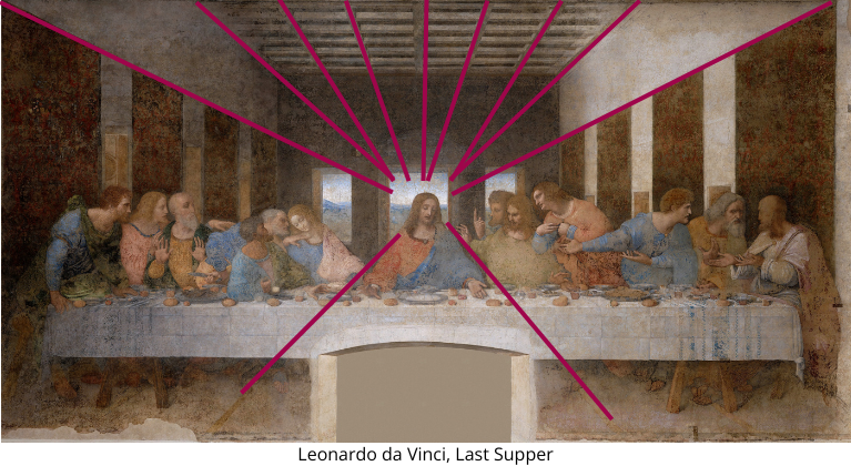
The grouping of the disciples in the Last Figure create for even groups, two on each side, with the triangular figure of Christ in the middle.
Asymmetrical Balance
Asymmetrical balance is achieved by arranging elements of different weight and size on either side of a central axis. Although the elements may not be exactly the same, the overall balance is still achieved by careful placement and proportion. Asymmetrical balance is often used in contemporary and abstract compositions and creates a more dynamic and unpredictable feel.
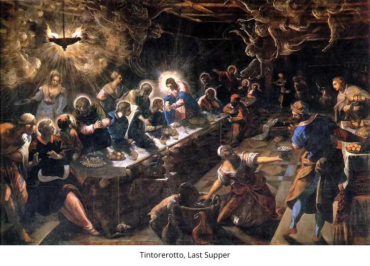
Unlike the High Renaissance style of da Vinci, Tintoretto’s Mannerist style of his Last Supper is asymmetrical, yet still balanced.
Radial Balance
Radial balance is symmetry in several directions at once, creating a sunburst or circular feeling. It can also be a spiral. See the Fibonacci sequence if you are unfamiliar with this amazing spiral that appears throughout nature.
In the Last Supper by Leonardo da Vinci, the Christ figure has many lines in the composition that lead to him. This radial balance leads the eye to the main figure. This artwork has both a symmetrical and radial balance. The magenta lines show how the architecture, and lines of the body lead to the head of Christ.
Visual Weight
When creating a painting, it’s important to consider the visual weight of each element. The size, color, and texture of each element contribute to its visual weight. The artist must consider the placement of these elements in order to achieve balance in the composition. It takes experimentation and practice. Try out ideas on a smaller scale before committing to a larger work. This will give you the emotional space to feel more free to trying out ideas.
It’s also important to note that balance does not necessarily mean that all elements must be evenly distributed. In fact, a painting can have a sense of balance even if the elements are arranged in a skewed or off-center manner.
Balance is a crucial principle of design for painters. Understanding the different types of balance and how to use them effectively can make it so much easier to greatly enhance the visual appeal of a painting. Whether it be symmetrical, asymmetrical, or radial, balance adds stability, harmony, and structure to a composition.


