Make Details Work For You
Details in painting can be a great way to portray your subject matter, and keep the viewer looking at your painting. It can also be a way to spoil what could have been so much better. This post explores ways to use detailed areas in your painting, have it improve the painting overall, while avoiding easy to fall into traps.
Noticing How We Really See
Our eyes see more than we should really paint. We don’t tend to notice the area we are not focusing on, because we aren’t focusing on it. So, when we look around (assuming we have good eyesight or the right prescription glasses) we notice all the details where we look. We can see the tree outlines on the faraway ridge top, we can see the lines in the leaves up close. But, what our brain has trained itself to do, is to ignore a large amount of details just outside the area we are focusing on. Try it out. Look out the window, as far away as you can. What is the furtherest detail you can see? Now, in that same direction, what is the closest detail you can see? Can you see them both at the same time? No. Probably not.
Avoid Overwhelm and Chaos – Edit!
As we paint, it is so easy to put in all the details on each area we focus on. However, the result of a painting done in this manner is overwhelming in the amount of details. When we overwhelm our viewer, they leave, quickly. Probably, not even knowing why. Our goal is to capture what interested us in painting this scene in the first place, and then to create a good painting. This means editing out unnecessary details that can be distracting. And, as always, this is not a hard and fast rule. There are paintings that are all about an abundance of overwhelming details, or photorealistic works, or Jackson Pollock drip paintings (hello, chaos!). However, most of the time, this is a good rule to follow: have details to make it interesting, but not too much to overwhelm.
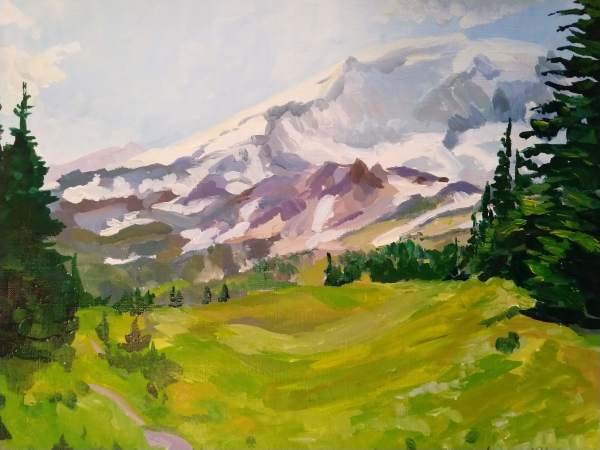
In the painting above, I wanted the focus to be Mount Rainier, so I used loose brushstrokes for the meadow area. Color and value changes were gentle. Then I framed the Mountain with a few details of trees, but not too many which would have been distracting from the main focus.
Brushwork
Details can be more than the details we think of – the clarity of a subject at a distance. It can also be in the brushwork. Are your brushstrokes even and consistent throughout? This may not be a good thing. Having a variety of brushstrokes in your work can be an excellent way to add interest. And, while the details may be in the foreground, another approach is to have bigger, more expressive brushstrokes in the foreground. In photography, there is “depth of field.” This is apparent when the subject is in focus and the surrounding or background is more blurry. You can use this technique in painting as well. Softening the edges, or reducing the contrast are a couple of ways to do it. You can also had more details into the focused-in area.
Ask Yourself
- Does this detailed area help the painting?
- Are there areas of calm in this work where my eye can rest?
- Are the details consistent? (More in the foreground, less in the background? Are they consistent within these areas?)
- Is there too much consistency? If there is a focal point desired, does it have enough detail? Is it the most detailed? For example, in a portrait, the eyes are the focal point, and just one eye more than the other.

