
One of the best qualities of paint is that you can build up paint colors, creating translucent or semi-opaque layers. You can also have opaque layers of colors, where paint peeks through gaps. This allows you to build up colors in a way that other mediums may not accomplish.
“Thick over Thin” Rule
A general rule of paint is “thick over thin,” meaning that the first layers should be the thinnest. The reason for this is slow drying nature of oils. If you are using oils, or slow-drying paint, be aware that thin layers on top of thick layers may crack as the thin layer dries faster, and as the goopy under layer dries it will crack the already dry top layer. If you enjoy cracks or are using fast drying paint, this rule may just be thrown out the window if you want. (Yay, rule breaking is fun!)
Underpainting
When you build up color in your work, a great idea is to think about what color you want to be under all the rest. This color will affect the rest of the colors. Some artists love to put a bright red hue down, creating red in any gaps between later layers. Many want to tone the canvas with a neutral mid-tone that allows darker and lighter colors to be applied on top. Still some skip underpainting all together.
I often get a lot of questions on this that start with “What should I do for the underpainting?” Or “Do I need to underpaint?” First, a gentle push back on the words “should” and “need” – there are no art police that are coming to get you. It is all choices, and you are in charge of your entire art creation world. Second, what do you want? What works easiest for you? And, most importantly, what will help you launch into the rest of the painting.
Here are some ideas:
- Create a neutral toned canvas. This means a value (light/dark) that is mid-tone. The color of this could be an earth tone (yay cheap paint), or something that will go with the rest of the painting.
- Create a light toned background. This could be super light blue for a bright sky, for example.
- Go red! Or magenta! Bold and bright and very saturated.
- Try out different colors on the same canvas. They can pop through and influence later decisions. This can be tons of fun.
Color is relative!
Beware! Or, rejoice! The color you take from your palette is not always the color you end up with on you canvas. It is like some magic spell can jinx your color mixing attempts. Never fear, you will get more used to this as time goes on and will adapt faster to it. I just giggle – because it is more fun than cursing. (Okay, sometimes I curse.) Test a bit as you mix. If you don’t want to make a mark on a canvas, you can hold your paint brush up to the canvas to compare how the color reacts to other colors already down.
Building Up Colors
Let’s say you want a blue sky, and you want texture in your brushstrokes to create interest, and continuity with the rest of the image. You can mix a variety of blues (more white, less white, more violet, greener?) and start working your strokes into the sky area. What do you like? Keep more of that. What do you feel isn’t working? Take that off (you can just scrape wet paint off with a palette knife).
Next, lets’ say you want clouds. Clouds have variety in them. Darker bits, more colorful bits. What can see from your source (real life or photo)? Would it be more fun to intensify the color?
Sunlight is white. (That is why we have white light.) However, as soon as we have particles in the sky that begins to change. Forest fires leave us with an orange sky, as if it is sunset all day long. The closer the sun is to the horizon the more orange the light. This is why polluted air gives you amazing sunsets – all those colors are being created by the bouncing! As you mix colors in this scenario, move the colors more orange.
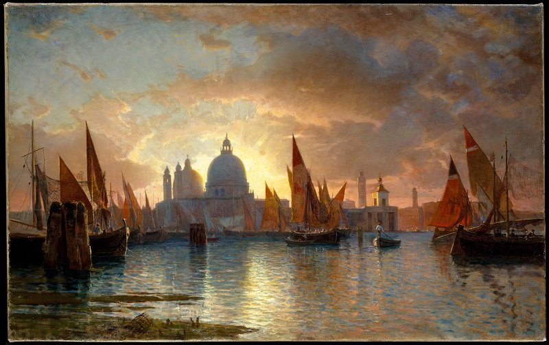
In the above painting, the light closest to the sun’s location is the brightest and most white. Then the paint becomes more colorful as it moves away, going from yellow to pink to a purple-blue. Notice the highlights on the clouds. Non of them are pure white. Also, see the same colors in the water?
Walking the Colors Around
When I use this phrase I am referring to color wheel. (Tubes on dog leashes need not apply.) As the sun gets lower in the sky, the light refracts off more particles turning the color a little more yellow, and orange. Using clouds as an example, at sunset, the highlights aren’t white! They are yellow, then orange, and sometimes pink. The lower the sun, the more you need to walk that color on around the color wheel.
With paint, you can apply beautiful, thick brushstrokes right on top of the of cloud for the highlights. In general, the lightest strokes in oil and acrylic should come last. The light sits on top of the objects, bouncing off and then reaching our eyes. Therefore, it makes sense for the light paint to sit on top of the other paint. (In watercolor, you are preserving the light, so it is different story.)

Loving these loose brushstrokes by Sisley. Take a look at the sky here. We have a darker blue (stormy clouds) on the horizon, thining at the top, with patches of a brighter blue. Notice the the puffy clouds at the top with the pink highlights. The sun is going to set on our two little road travelers. This is the sky right before sunset. The sunlight doesn’t touch the landscape below, blocked by the clouds. Take a look at the grass. Bits of different colors create the ground. I always feel it is an act of magic to create little landscapes out of paint!