What is “Color Temperature”?
Color temperature is how warm or cool a color feels. For paints this means that:
- Warms: Red, Orange, Yellow
- Cools: Green, Blue, Violet

Color temperature in lighting is a bit different. That refers to degrees Kelvin. We will leave that for a different post.
Color Temperature Behavior
Warm colors come forward in a painting, and cool colors recede. If you want a person to pop out at you, but you paint them wearing black and blue clothes, you are going to have a tougher time than if you painted them wearing bright orange. Think about “high visibility” vests – they are the brightest yellows and oranges you can find. (What I like to call the “don’t-shoot-me-I’m-not-a-deer orange.”)
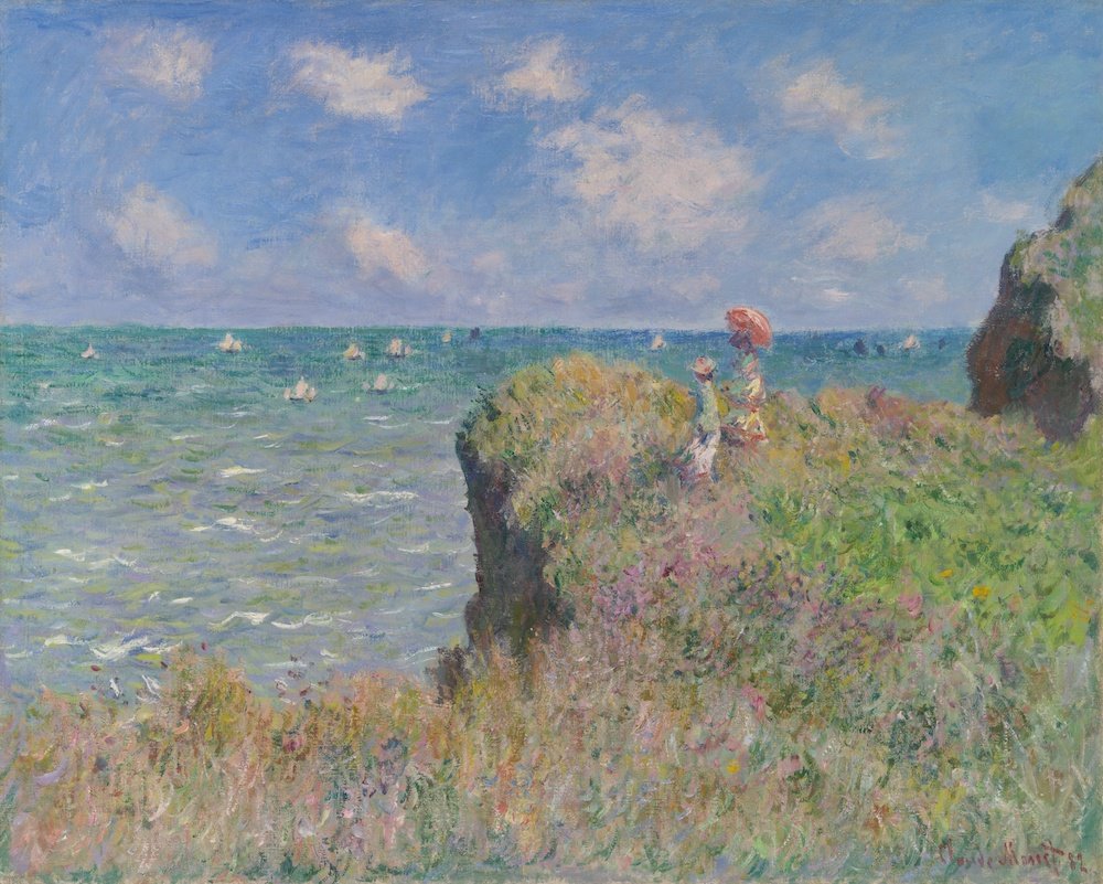
Claude Monet. Cliff Walk at Pourville, 1882. Art Institute of Chicago.
In this painting by Monet, we notice the woman’s parasol, and her dress because of the biggest pop of the warm reddish color. This painting balances making the people part of the landscape by using the same brushstrokes to render both, and then drawing attention to the figures by use of color.
Primaries – Cool & Warm
Each color has cooler and warmer hues. A color wheel is a great tool to help understand this concept. Let’s take “red” for example. Red is a warm color. However, an orange-red is warmer then violet-red. Think of a dark red cherry. It is still a warm color, but it is on the cooler side. A bright red fire truck is on the warmer-orange side. It is nearly impossible to have a true “red-red” and so it is important to always know which way your primary colors are leaning.
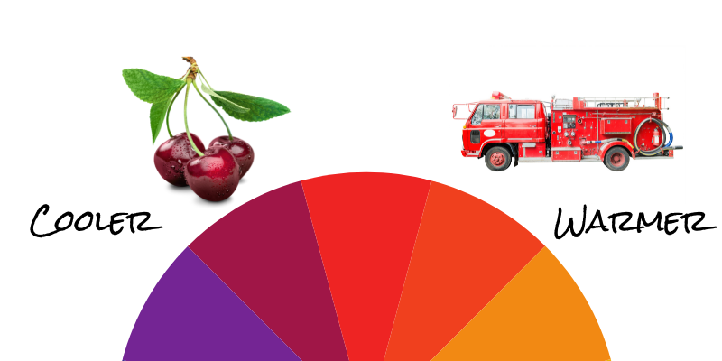
Each color on the wheel has a warmer and cooler side to it.
This is very important when it comes to choosing the paints you want to use. If you choose a warm and cool of each primary you have an extensive mixing range. It is key in not making your colors muddy when you don’t want them to be. Remember: red + yellow + blue = brown. So, if you mix a purple by using a red-orange and a blue you will get a brownish-purple. (The red-orange invited yellow to the party.)
Context = Change
Color temperature is relative to the colors beside it. The same mix of paint on your palette may look different when applied to different locations in your painting. Because, its neighbors are different. This can be super frustrating if you aren’t aware of it. It’s like some kind of black magic where that perfect color is suddenly different the moment your brush touches the canvas. The best idea is to have a mindset that it is “surprising” instead of “frustrating,” and to paint A LOT to get used to how your colors behave with each other. This is one of the reasons many painters will use the same pigments for years, making changes very slowly in their palette.
Pigment Variation
So there you are. You got it all figured out and then run out of that one tube. You go down to the store, and grab the same color, but a different brand, maybe one that was on sale. Will it matter? Probably.
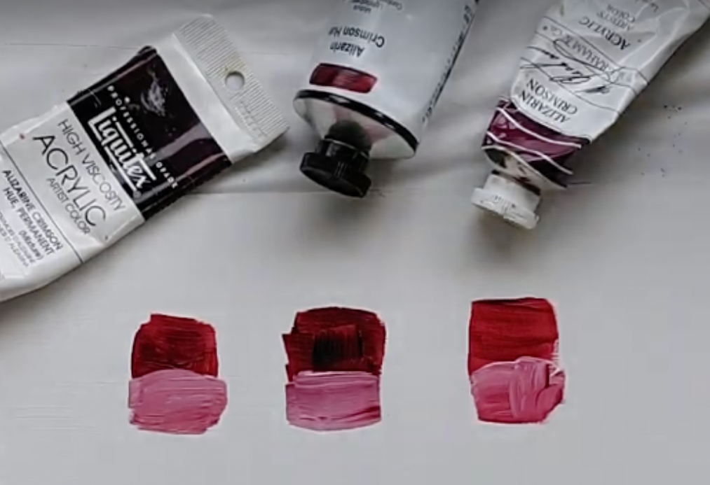
Alizarin Crimson mixed with Titanium White. Notice the variations among brands.
Here are three acrylic tubes of “Alizarin Crimson.” None of them are the same hue. I have seen wide variations on earth tones as well, sometimes such a big swing that I thought it was a different color altogether.
Do Try This Out at Home
Knowledge without action won’t help you improve. So let’s take this knowledge for a spin!
Project #1: Creating YOUR Color Wheel
- Decide which medium (watercolor, acrylic, oil, etc…)
- Pull out all of your primary colors. (Reds, Yellows, Blues)
- Try and sort them based on the color wheel. Which colors go where? Lay the tubes out in a circle at this point.
- Grab a piece of paper you can paint on.
- Using a dab from the tube (or a clean brush for each color), apply a small amount of paint to the paper. This does not need to be perfect.
- Were you correct? Did you have colors out of order?
- If you want, label your color wheel so that you have a chart of your colors for future reference.
Project #2: Exploring Mixes
- Choose a secondary color to mix. (Orange, Green, or Purple).
- Grab a few tubes from each primary involved. (Orange: Red+ Yellow, Green: Yellow + Blue, Purple: Red + Blue).
- Try mixing a warm and cool color combinations. What happened? Can you see how warmer mixed with cooler makes browner colors?
Happy painting!