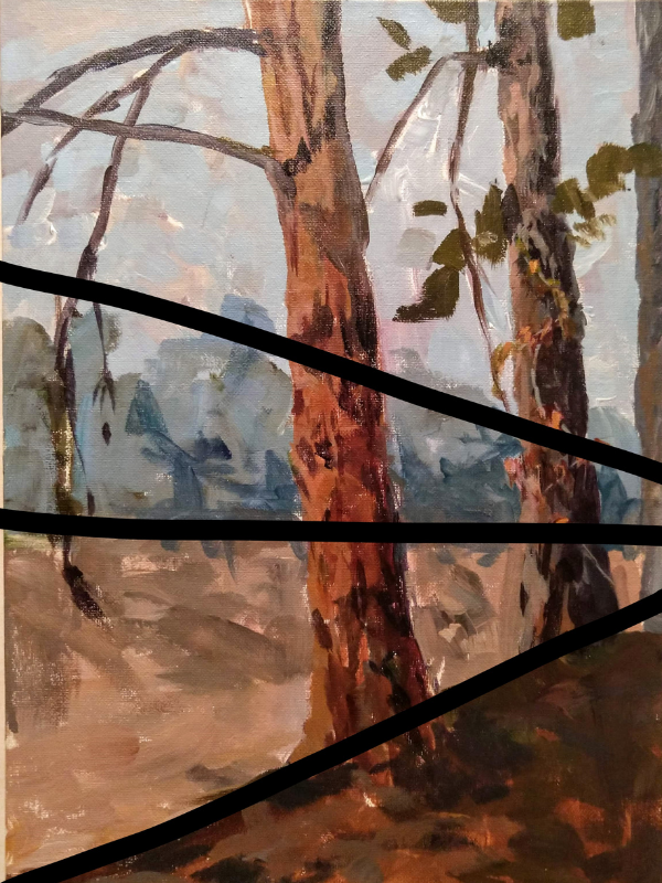
This plein air adventure was a great opportunity to play with a composition idea. I will lead you through my choices, their reasons, the successes, and where I improve if I were to go back to it.
In general, a main rule of composition is that you don’t place the main object right in the middle of your page. (Subject/object in the middle of the page is what an advertisement looks like.) Often the advice is to put the main subject 1/3 of the way into the pictorial plane space (the rule of thirds).
Here I decided to play with breaking that idea and see what I could do to recover.
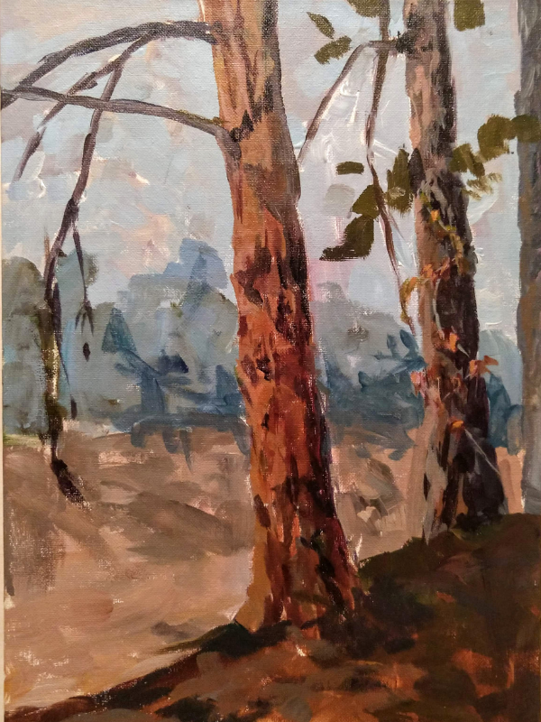
My goal for this painting was to draw attention past the tree in the middle, let’s call that Pine#1, to the second pine. The second pine had a pretty vine on it that was changing colors. I started to capture that towards the end. If I went back into this painting at the studio, I would accentuate that vine even more. The light through the changing colors of the leaves wasn’t quite accentuated in the painting the way I had envision.
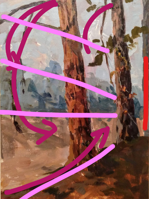
After deciding what I wanted to paint, I next thought about how to lead the eye past Pine #1 to Pine #2. I decided that the knoll that the trees were on would make a good diagonal, and that I could mirror that diagonal to create a triangle.
I tried adding green pines in the background. It became to distracting and eye catching. I took them back out by scrubbing the sky color into them and making sure I removed any detail that was too eye catching. This created a far distance effect, as if a sunny meadow is in between two groups of trees. This was much more scenic than the parking lot that is actually there.
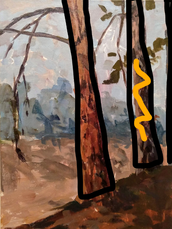
Next, I looked at other lines to help curve the eye around. Here I thought of how my eye, at any given point, could be led past Pine #1 to my goal of Pine #2. The red line is where I added a tree, to keep the eye from just leaving the page altogether.
Light magenta – lines covered above, plus the branch. Helping to create triangles to lead the eye to the point. The darker magenta lines show where I used the branches to create lines to keep you eye going around and heading back to the other lines.
Time spent: 2 hours
Paint: Golden OPEN acrylic (slow drying)
Colors: Dioxazine Purple, Yellow Medium, Alizarian Crimson Hue, Phthalo Green (Blue shade), Titanium White
You may think, wait – no blue?? The blue I mixed for the sky and the trees in the back ground came from mixing Dioxazine Purple + Phtalo Green + Titanium White.
