
Painting fall colors are so inspirational. Bright and bold, these temporary splashes of color are fun to celebrate. Here, I walk you through a step-by-step journey of painting a leaf – with a focus on color choices.
Materials:
- Fantastic leaf from tree near my house. (Thank you tree!)
- Canson art paper for oil/acrylic (I used a quarter sheet)
- Small paint brushes
- Cup of water
- Palette
- Acrylic Paints (I love Golden) – Hansa Yellow Medium, Quinacridone Magenta, Quinacridone Burnt Orange, Napthol Red, Zinc white, Titanium White, Phthalo Green.
Starting
I lay the leaf down on the table in front of me, and set up my work area. You don’t need much area to do this project. Great for those of us with a table-top for an art studio.
Working with tubes I already had on-hand, I choose transparent colors that I thought may work. I was looking for yellows and reds to mix oranges, plus a red a bit to either the brown or darker purple side. I figured I would stay with zinc white for a while, to maintain the translucency when using white. You don’t have to have the exact colors I had, but know that transparent colors work really well for the glow, and have warm and cool reds.

I knew that this would take a few layers, and so I dove right into painting the shape of the leaf. 
Adding More Shadows and Deeper Colors
Next up, I begin developing and exploring the depth of the colors. By mixing more of the brown/violet reds into the existing reds, I can deepen and darken the color. And then I also lighten the lower edge of the leaf with more yellow.
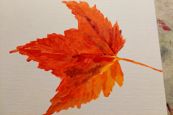
A few areas become less transparent as I added titanium white – especially to the yellower areas. All color transitions are slight, mixing slowly from one color to another. The direction of the brushstrokes helps create the form.
Background Color
Background colors are often hard to choose if you aren’t aware of this simple trick – pick the neutral created by subject matter. To do this, take a look at the color wheel below.

The main color of the subject is pointed out with the black arrow. The analogous colors used are shown with the black arc. The OPPOSITE color of the main subject is the color that will neutralize that color. In this case, phthalo green is directly across from the reds we were using (gray arrow). By mixing red + green we get a neutral color. Adding white, gives us variation in the values.

Here, the initial color painted on is dark in value. I did this on purpose, so that I would not have to come in an paint the shadow color again around the leaf edges. As I feathered this color outward, I added more white. Especially as nearer the top of the background area. It is a natural feeling to have the lighter values on the top. It also helps with the lower edge of the subject matter being lighter. (Lighter subject= darker background, darker subject = lighter background).
Finishing Strong
It’s not enough to just cover the paper with paint. I want to make sure that all my edges and values make sense. I went back over the edges of the leaf. Adding a bit of darker red along the lower edge. That helped it pop! And little gray-green dots to create the natural speckles I saw.

My favorite part of this painting is honoring the light that came through the leaf onto the table. By adding leaf color in the shadow, this painting really transformed.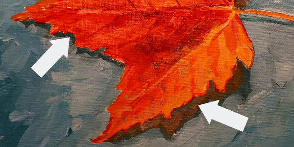
The arrow on the left shows the original dark value first applied to the painting. And, the arrow on the right shows the warm color of the subject matter on the shadow. This creates the illusion that the light came through the leaf and fell onto the surface below it.
Hope you enjoyed this post. Sign up below for my blog posts to be delivered to your inbox, and for notifications on classes – both in-persona and online.
I appreciate comments and sharing!