
The Quest for Realistic Greens
Many painters find that mixing up a realistic green is the hardest color task. If you have struggled, know that you aren’t alone! Over the years, a painter often develops their “go-to” formula for the greens they need. This post will explore what those have in common, and how you can create your next favorite go-to-green.
Blue + Yellow = Green. Sometimes.
When we take out our blue and our yellow and then mix together some dismal green, this is often when the self-doubt creeps in. “What am I doing wrong?”or “Why isn’t this working? I learned this in kindergarten (enter swear words here).” The reality of color mixing can be a bit more complicated. However, once you figure out a few simple rules, it will help a ton!
Black + Yellow
The colors in our world are hardly ever fully saturated chroma. In fact, super colorful things immediately draw our attention – like a blooming red flower in otherwise green garden. When creating greens for landscape paintings, we often need a much more desaturated color (grayed down). I believe that is why the yellow+black combo is so popular. The black adds the desaturation while it acts as the blue. Creating a more “realistic” green.

Color Temperature
Every paint hue leans either warmer or cooler in color temperature. Warm colors are the reds, oranges, and yellows. Cool colors are the greens, blues, and purples. If you imagine a color wheel.. or… let me help with that … 
… each pigment is either a warmer or cooler version of that color. For example, Ultramarine Blue leans towards the purple side of the blue while Manganese Blue Hue is to the green side. For each of the pigments that you plan to mix with, it is important to know if they are warm or cool.
Tip: Warm colors appear to come forward, and cooler colors retreat. If you have a warmer color in the background, it will compete with the foreground.
Intensity
You can raise and lower the intensity of a color. There are several ways to approach this.
To lower the intensity, you need to make the color dirtier. By that, I mean that you need to either add white, black, both (gray), or create a brown. Brown happens when you add a third primary color to the party. For example: if I have a green made from a yellow that leans to the green, and a blue that leans to the green side, then I will have a very bright green. Lots of chroma. However, if I switch out that yellow for a warmer yellow, I have invited a small bit of a red to the party.
You can dramatically lower the chroma of color by adding the complementary color. (The opposite on the color wheel). The benefit to graying down with complementary color is that it creates a chroma shift with a minimal hue shift. It doesn’t make the color more white or more yellow, for example. And, it keeps the color lively because the gray is a mixed gray of two compliments not the dull gray of black.

Notice how adding the white to the green doesn’t make great green color for such things as most tree leaves. This is why adding yellow is so important!
The Loose Formula
Blue + Yellow. Hey, wait. We started here. But, hang on! Whatever you are using for blue on your palette, and whatever you are using for yellow. Then to gray it down, add a touch of whatever you have across the color wheel from the result (probably something red). If it gets to dark, add more yellow or white. You can use a warm yellow and a cool blue to start to have this effect built in. This is why Ultramarine Blue + Cadmium Yellow Medium already begins a bit “grayed” down.

Blue(ish) + Yellow(ish) and if too intense + Red(ish)

Out of theTube (NOOoooooo…..)
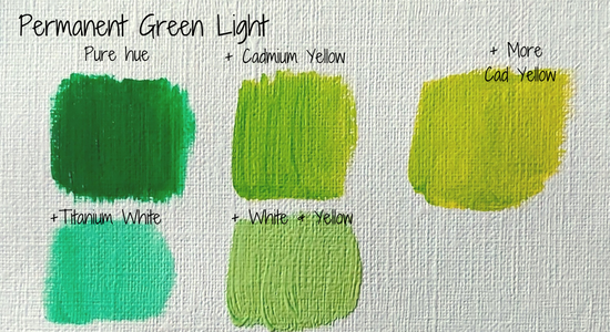
“But Kristen,” you may say, “I have all these super sweet green colors I bought at the store. I can just use those.” I come to you with my own experience. There was a moment in art college where someone called me out for all my trees in a painting being “sap green.” I hadn’t even known the name of the tube I was using. I dug out my paint box after the critique, and yep, sap green. The problem with out of the tube isn’t some kid with attitude knowing its name. The problem is that we are losing our color harmony by not mixing with the colors on our palettes. We need everything to mixed with a friend before leaving the palette. I assure you, it will make a better painting, even if it feels like that is the exact color you need. Trust me. Or better yet, try it out and see for yourself!
Practice
There really is no substitute for practice. But, having the knowledge and not blindly practicing is much more fruitful. Look through your existing paint collection – can you imagine all the amazing green combos you have in there? Try a few out. Creating a mixing chart – keeping notes as you go – is a perfect way to do this. That way you don’t have to worry about creating “art” you just get to play with color. Maybe you will discover your next go-to green. Mine is phthalo green + cadmium yellow + a touch of alizarin crimson.