
How to paint something that is white may seem easy at first, but white creates a unique problem. Values do a lot of the work in a painting (usually while color is stealing all the credit). Values are the light-dark scale. When we paint a subject matter that is white, we still need to give ourselves room to add values. How do we do this?
First, we need to step down the “white” we feel the object is to something darker (less bright). Normally, to darken a color, we will add its complementary color, but since white isn’t on the color wheel, we have two choices.
Choice #1: Add black. Bleh. While this a highly effective way to dull down white, it is going to create gray. And not a fun gray (totally a thing), but a dull gray.
Choice # 2: Add color. All color is darker than white. Which means any color will work to darken a white. There is a lot of room to play here. Let’s explore this more.
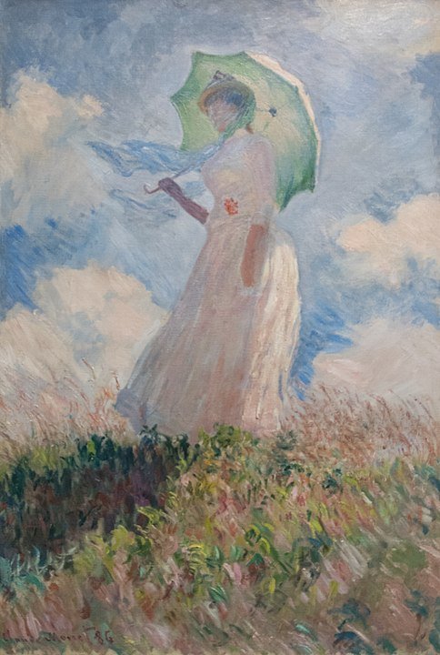
Claude Monet, Woman with a Parasol – Madame Monet and Her Son, Oil, 1875
Keeping the majority of the hue we are creating based in white, we want to add color very slowly while we mix. For this post, when I saw white, I am talking about Titanium White, as it is opaque and stronger at tinting. Monet did not have Titanium White, but used closely equivalent colors.
Warm colors come towards you while cool colors recede. If we use this as a starting point, we could add yellow to white for bright to mid-tones, and a purple for the shadows. Not very much! Just enough to create value shifts. A perfectly complimentary pair will create a neutral gray – (the fun gray!) and allow you enough values to create form.
Painting Snow
A great color combo for snow is orange and blue. Create your highlights with a touch of orange in them. Orange is a great choice for two reasons. One, is that the opposite is blue, and blue is natural “shadow” color. See this blog post for more information on that topic. The second reason is that orange is very vibrant and warm. This helps with the contrast from the blue, and a feeling of light reflected. Orange is more of a contrast from blue then white, so it creates a bigger range that just painting snow with white and blue.

Take a look at the Monet painting of wheatstacks in the morning. What colors do you see? See how the shadows are more blue and violet, and the sunlight areas are more pink than white. And yet the overall feeling is that we are looking at “white snow.”
Most Impressionist paintings are high key (values that are mid-range to light). This is a high key painting. The full lack of dark values is hard to comprehend until we remove the color.

Now we can see the lack of darker values clearly. The range seems to have diminished, and that is because the color choices in the original greatly increased the feeling of full range of values. Using the blues/purples for the shadows and the warm colors for the highlights on the snow created a broader range.