
Why Winter Sunlight is Different
In the winter, the sun goes through the sky in a much lower arc than summer or spring. Just as sunrise and sunset are affected by the low position in the sky, so is the winter sun. Depending on where you are, this can be a dramatic effect. The closer to the pole you are in the winter, the shallower the angle is of the sun compared to the ground.
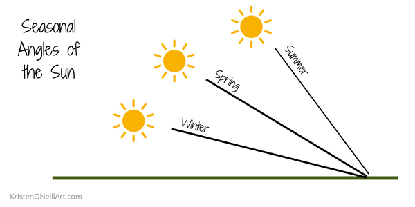
This lower angle effects the lengths of shadows, and color of the sunlight itself. When I first moved to the Pacific Northwest, my first winter I felt like it was 4 pm all day long. That was because I had moved from Santa Cruz, California (36 latitude) to the Puget Sound area (47 latitude). The sun was at Santa Cruz’s 4 pm level!
While we could get all stuck in the math and geometry of where we are on the planet and where the sun is, the easiest way to know what to paint is simply to observe real life. And then, having the understanding of what is going on, helps us not unconsciously make changes to put the sun where we think it “should” be.
Lower Angle = Longer Shadow
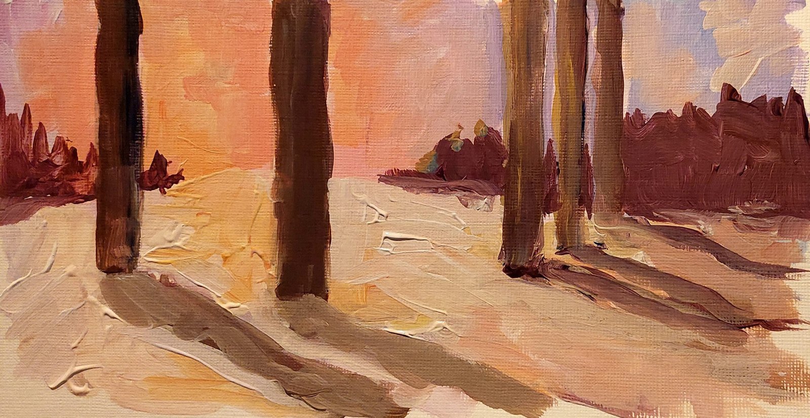
In the winter, the sun casts longer shadows than it would at the same time of day in the summer. Winter landscapes can use this to their advantage by having long interesting shadows as part of the composition. However, the intensity of the shadow is lessened because the sun rays are more spread out at the shallow angle. So, in the summer, shorter & stronger, and in the winter lower & longer.
How Winter Sunlight Effects Color
On a sunny day you can really see the beautiful colors of winter at play. Since the sun is lower in the sky, it is more affected by the thickness of the atmosphere. Colors are shifted more orange. I like to look at how I can add more pinks, oranges, and yellows to the light. Since pink is really red with white added, try out a transparent magenta to avoid something too red.

Painting Winter Sunlight
Okay, enough science! Let’s talk paint. The best advice I can give comes from Peter Fiore, “Always remember that you paint the effect of light on your subject, not the local color of the subject.” Confession. When I first read that, I went back and read it 3 more times. Mind totally blown. Of course we paint light! Light is the only thing we see. But, how often are our helpful brains jumping in the way telling us things like, “tree trunks are brown.”
By the way, if you aren’t familiar with Peter Fiore, here is his Instagram (I don’t want to share an image without his prior permission) https://www.instagram.com/petermfiore/
As we paint, let’s ask ourselves, “What color am I seeing there?” instead of “What color is that object?” The lightest colors are on top, brush stroke wise, as the light falls on top of an object. If we are using an opaque medium (acrylic, oil, gouache, etc) then we work dark to light. If we are using a transparent medium like watercolor, the light has to be preserved and we work light to dark.
Not-So-Sunny Days
I live in Oregon. I am very familiar with not-so-sunny days in the winter time. And, this muted light can be annoying. Not only do you get in a winter funk, but you miss the contrast that sunny days bring. However, we can still find the colors of the winter sun. Let’s turn again to a master. Alfred Sisley, one of the most consistently dedicated Impressionists to painting en plein air, painted this winter scene:
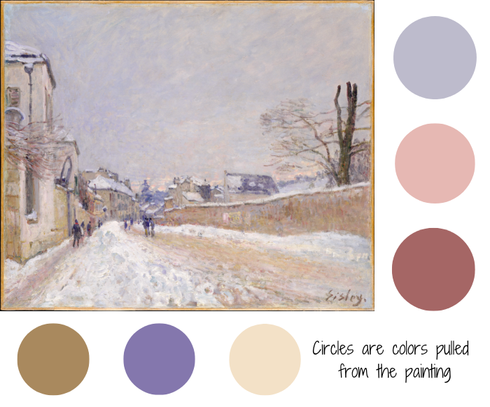
Rue Eugéne Moussoir at Moret: Winter, Alfred Sisley, 1891, Oil on Canvas, 18 3/8 x 22 1/4 inches. Used with Permission.
While it is not a sunny winter day, the hints of the colors of the winter sun peak through in warm color bits in the sky. All the colors that make the buildings and the snow are warm. And, the “cool” color is purple – which has the warmth of a red in it. Pops of darker values (people, and the tree) help emphasize the light. The key to making these lighter colors work here is that he desaturated them. Nothing is garishly intense, and there is a consistency to the lighting that makes sense to us.
Try this at Home!
Two Approaches to Painting Winter Sunlight
Let’s paint snow in our example:
Approach #1:
Creating a high key value painting like the Alfred Sisley painting above.
- High key values – mid-tones and lighter
- Desaturate colors
- Softer edges
- Lower contrast in transitions
- Tip: Keep a simple composition so that you can concentrate on applying your knowledge, and not worry about filling up space.
Approach #2:
Create a vibrant color winter scene. Check out these painters to inspire you (links go to my Pinterest boards)
